Company Analysis
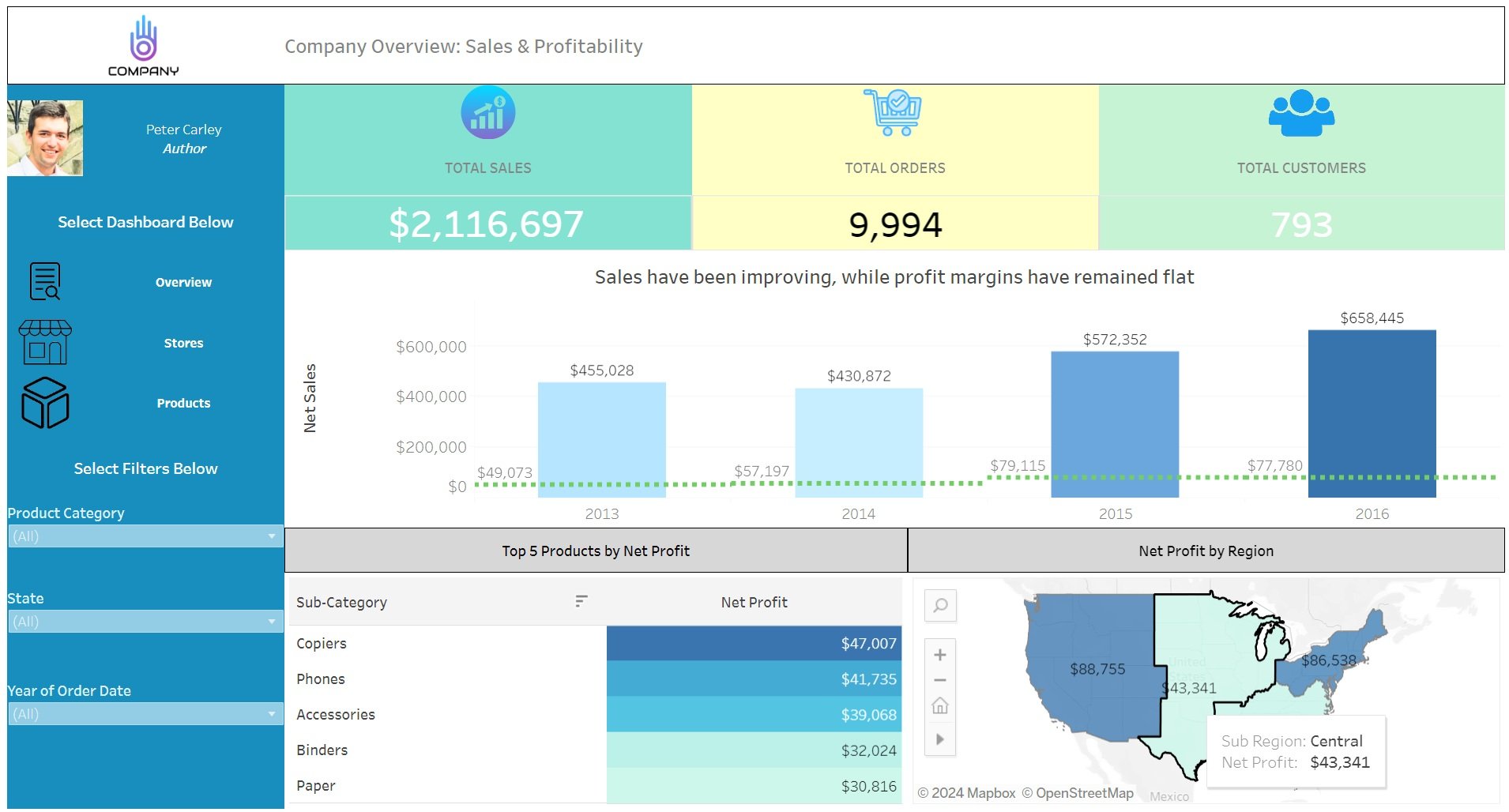
Using Tableau’s sample store dataset, I built a dynamic Tableau dashboard that showcases sales and profitability through different lenses of the business.

Store Location & Performance Analysis
In the below page, I analyzed the profitability by store, with a mapping of locations color-coded by profitability.

In this dashboard, I implemented a few key design features that I think are paramount for proper data visualization
Simplicity
Keeping high-level metrics at the top of the visual
Limiting amount visualizations in a dashboard
Self-Service Possibility
Including icons and clear labels for any visuals
Having a clear section where the user can filter data
Drill-Through Capabilities and Smart Tooltips
Including pages and pop up windows that allow for more detail